Lifestyle photo
Person using Zelle app on iPhone
A ground-up UI/UX redesign of Zelle’s digital payments experience — transforming a bank-embedded utility into a standalone fintech platform capable of competing with Venmo, Cash App, and PayPal.
Zelle processes over $800 billion annually — more than Venmo and Cash App combined — yet most users don’t even know it exists outside their banking app. The challenge wasn’t building payments infrastructure; it was designing an experience worthy of Zelle’s scale.
We set out to reimagine Zelle as a standalone platform: a product that retains the trust and security of bank-backed payments while delivering the intuitive, social, and feature-rich experience that younger generations expect from their financial tools.
Competitive analysis across Venmo, Cash App, and PayPal. Identified Zelle’s unique advantage — bank-grade trust — and designed around it.
Every screen designed for iOS with SF Pro typography, native-feeling interactions, and micro-animations that respect platform conventions.
FDIC protection badges, verified contact indicators, and fraud prevention education woven naturally into the user journey.
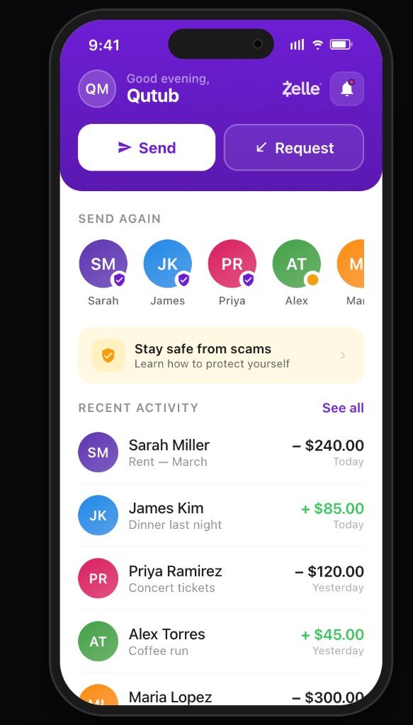
The dashboard was rethought around intent. Primary actions — Send and Request — are surfaced immediately in the hero gradient, while supporting tools remain readily available. The result is a balanced environment that turns daily money management into a quick, confident routine.
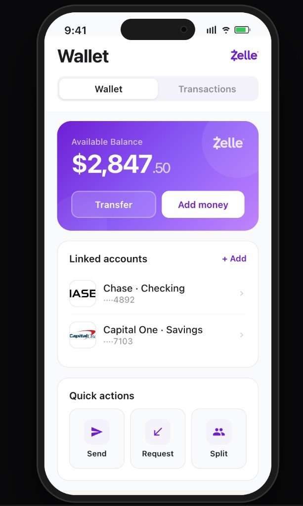
We introduced a wallet-first architecture inspired by Venmo’s proven model, but elevated with bank-grade seriousness: a glassmorphic balance card with real-time linked accounts, FDIC protection indicators, and quick actions for Send, Request, and Split.
Every screen designed to feel consistent, responsive, and effortless — from home dashboard to wallet management to activity history.
One of the most critical flows in the app is connecting a bank account. We designed a three-state experience — selection, connecting, and linked — that maintains user confidence throughout. Popular banks surface immediately with recognizable logos, while a search-driven list ensures every institution is accessible.
The connecting animation provides real-time feedback, and the linked confirmation reinforces trust with a clear success state. This flow directly addresses Zelle’s core challenge: making bank-grade security feel effortless.
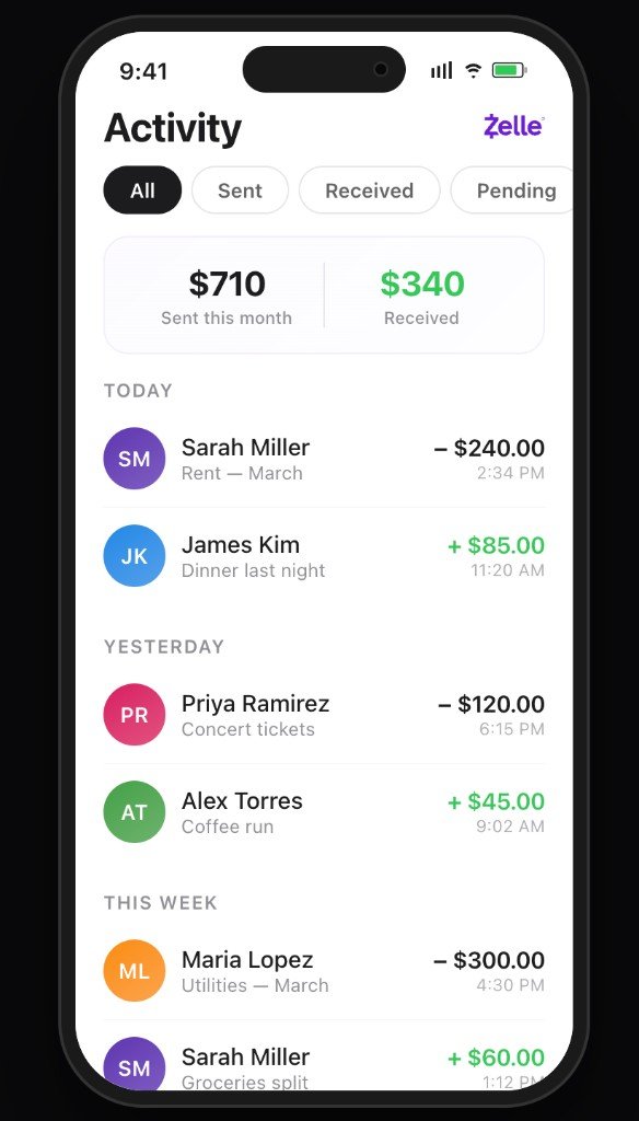
We designed 10+ interconnected screens that form a complete financial ecosystem: onboarding, bank connection, home dashboard, wallet, send flow, activity history, contacts, profile with QR payments, safety center, and settings. Each screen contributes to a larger network, extending Zelle’s reach while keeping the user journey consistent and effortless.
The color palette centers on Zelle’s signature purple — conveying both financial authority and modern approachability. We introduced a gradient spectrum from deep violet to soft lavender, complemented by trust gold for security indicators and a clean iOS gray system for content hierarchy.
SF Pro for the native iOS app experience. Plus Jakarta Sans for the marketing wrapper. Every weight, size, and spacing calibrated to the iOS Human Interface Guidelines while maintaining Zelle’s brand personality.
This redesign demonstrates what Zelle could become — a product that doesn’t just move money between banks, but fundamentally changes how people relate to their finances.
Product & Design
Over 8 weeks, we moved from research and competitive benchmarking through design system creation to a fully interactive prototype.
Deep-dive into Venmo, Cash App, and PayPal. Identified Zelle’s positioning gap and defined the product opportunity.
Mapped user flows for 10+ screens. Restructured navigation around wallet-first architecture with bank connection onboarding.
Built a comprehensive system: typography scale, color tokens, component library, spacing grid, and interaction patterns.
Delivered interactive React prototype with full screen navigation, micro-animations, and realistic data — ready for stakeholder review.
The scope of this concept redesign reflects the ambition of transforming one of America’s largest payment networks into a consumer-facing product.